The OED system has a number of features. This page describes many of them in the context of how they might be used at an academic institution along with links to further documentation. The features page overviews OED's capabilities in terms of each feature rather than uses and shows a number of features not touched on this page. Some people may wish to see a number of these features by using our live demo site. Also note that there are many options for graphics and this page often gives one example. The "Further information" links to the OED help web pages provide all the options.
The uses and primary features they demonstrate that will be discussed are:
The examples that follow will use the following meters. Note that OED uses the term meter to apply to a data collection item since it is often a physical meter on a campus.
These are a subset of the example data used throughout the OED help pages.
Different people want to see energy usage in different ways. A classic use of an energy dashboard is to show graphics of usage such as
We will now look at each of these.
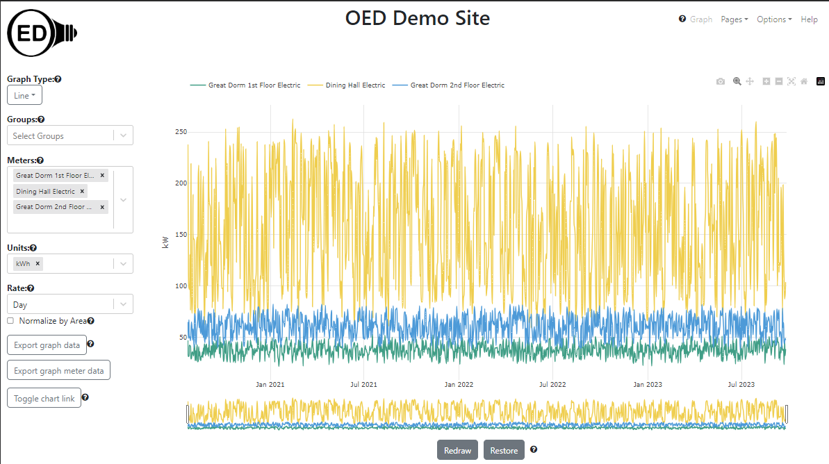
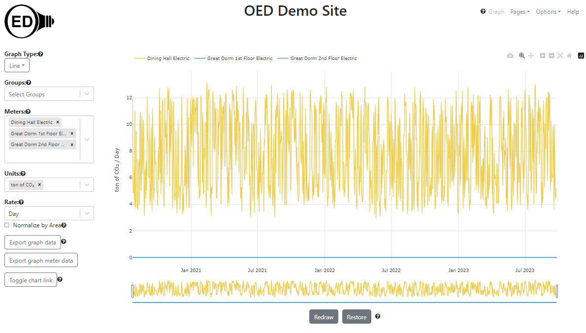
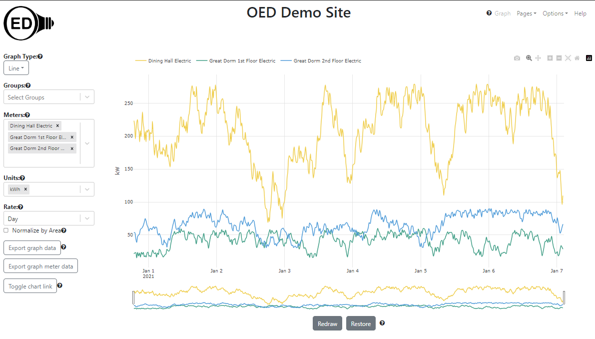
The following graphic shows the electric usage for each of the three electric meters as a line graph of usage vs. time:
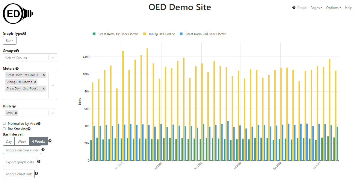
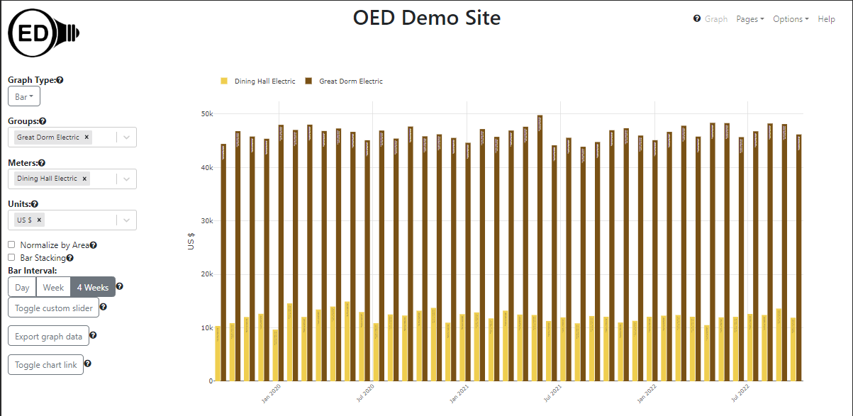
The following graphic shows the same usage but as a bar graphic where each bar represents four weeks of usage:
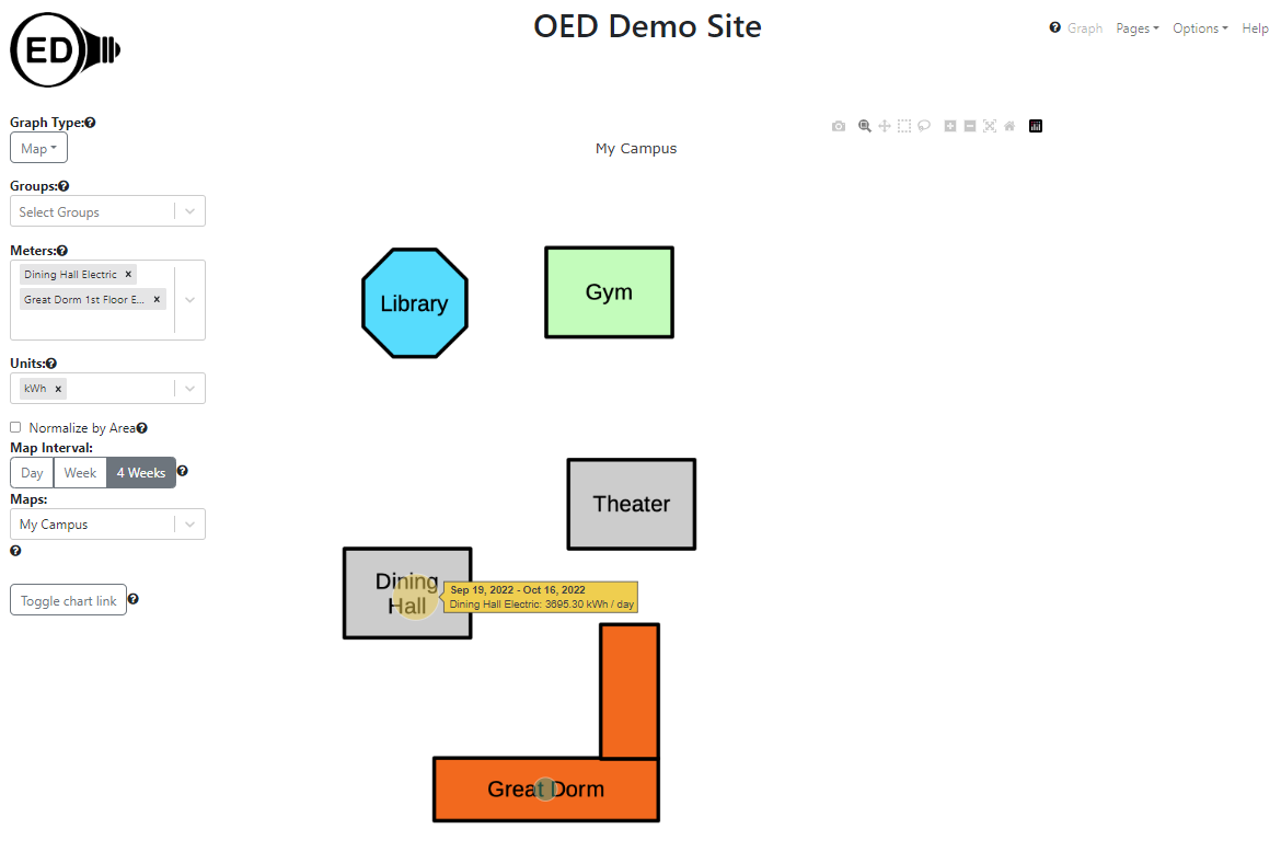
The following graphic shows the electric usage in Great Dorm 1st Floor & Dining Hall as a map where the circle size indicates relative usage. Great Dorm 2nd Floor Electric could also have been shown but meters for the same building are harder to see since the circles are at the same location. In this case it shows average usage for the last 4 week where the hover shows the exact value for the Dining Hall. All types of graphics support the hover feature.
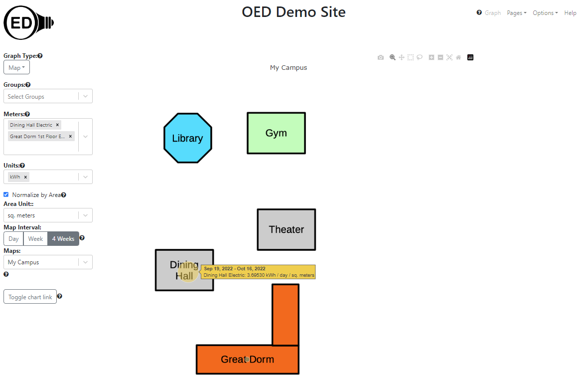
One might wish to see the usage normalized by the size of the building. The following figure shows this for the previous map but any graphic could have this done. The hover shows that the value reduced by a factor of 1,000 because that is the area of the building in sq. meters. The figure also presents the fact that the dorm is significantly more energy efficient considering its size because the circle size is much smaller in this figure.
One may wish to also see data in another unit. The line graphic above is shown in the figure below but for ton of CO2. per day. The Great Dorm has zero for its value because it uses solar electricity which is assigned to have no carbon footprint (site chosen value).
Further information: Graphical display of data, Line Graphic, Bar Graphic, Map Graphic, Area normalization and Graphing units.
An academic institution often wants to show usage for different areas on campus. For example, you might want to show the total usage for all residential buildings. OED can aggregate (sum) any combination of meters via its group feature. In this example, a nested set of groups will be created to show the total resource consumption for two buildings. Graphically these groups were created as shown in the following figure. The meters are shown in blue and the groups are shown in yellow.
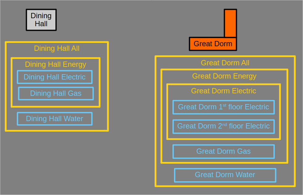
OED allows for creating groups from groups. This can greatly simplify grouping items as they can be built from previous groups. Given this, the Dining Hall group was created as follows:
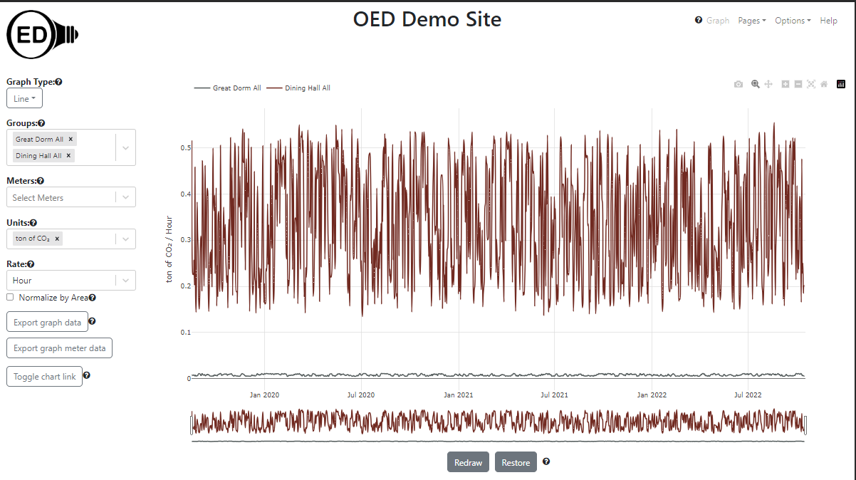
The figure below shows the usage of "Dining Hall All" and "Great Dorm All" groups on a line graphic but groups can be used with any graphic. It is graphed in ton of CO2. per hour. The graphic clearly shows that the Great Dorm is generating a lot less CO2 than the Dining Room.
Further information: Groups.
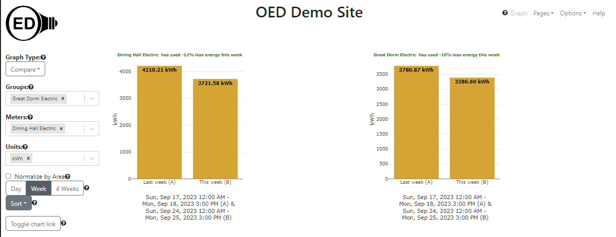
To engage students, some academic institutions use energy competitions. In a common usage, different buildings complete to see which ones can reduce its usage the most. The comparison graphic in OED supports this type of competition. In the following figure, the total electrical usage from last week vs. this week is displayed for the two buildings so it uses the Dining Hall Electric meter and the Great Dorm Electric group. It was created on Monday afternoon. The graphs are sorted so the building with the greatest decrease is first but one can choose to do the least first or alphabetically. One can include as many items desired on one comparison page (only two shown here).
Further information: Compare Graphic.
It is common for an academic institution to want to graphically show energy usage on a website. Someone can create any graphic view they wish and then click the "Toggle chart link" button to reveal a web address (URL). That web address can be reused anywhere (web page, email link, etc.) and it will recreate the OED graphic that was shown when it was created. One feature is that the link recreates the same look but with current data. What this means is that if you had a link to a compare graphic to show usage for the last week that was created at the start of January, if some used it in the middle of February they would see the same comparisons (such as the two buildings in the example above) but for the current week in February.
Further information: Chart Links.
For many reasons, OED normally shows daily points when a line graph is first shown. Seeing this level of detail on energy usage is often sufficient for most users. Some users, such as energy managers and sustainability coordinators, may wish to see usage on shorter time scales to investigate interesting usage patterns. OED allows users to zoom in on time frames and scroll across times. You can also have OED redraw a graphic to get shorter time frames for each point. OED can display data as daily, hourly or the original meter data. This allows the user to see the data at appropriate time scales depending on need. The figure below shows original meter data for the first week of January 2021 that is every 15 minutes for these meters.
Someone may also wish to see the cost associated with buildings. In the following figure, the cost of the electrical usage for the two buildings is shown on a bar graphic. The fluctuation in cost and the relative cost is easy to see.
Further information: Zooming & Scrolling.
When students are investigating energy usage, they often need to work interactively with the data. OED is somewhat unique in that it allows users to interactively choose what information to display including the meters, groups, time frame, units and frequency of points. OED uses a sophisticated program so that any user choice is normally displayed within one second. This allows users to look at the data in various ways to understand what is going on. As discussed above, this includes focusing on specific dates/times that are of interest. OED recognizes that there are times one wants to have the energy data (readings) to analyze them outside OED. This could be to do a type of analysis OED does not support. To allow this, OED has two export features for line or bar graphics. The "Export graph data" gives the energy data shown on the current graph. Thus, if one is showing the data with daily points then you will get one point for each day for each meter or group. The "Export meter graph data" exports at the resolution of the original meter data. For example, if the meter displayed collected readings every 15 minutes then one would get a point every 15 minutes. In either case, the export provides a CSV (comma separated values) spreadsheet file with the reading data. Given that OED can rapidly display any graphic, the user can use this capability to get the exact data they want before exporting. This reduces the size of files downloaded and allows users to take advantage of OED's capabilities to get grouped data, limited time frames, bar data, etc. This feature can also be useful to facilities and sustainability coordinators.
Obviously, the meter data normally creates a much larger file since it has more readings. To stop inadvertent downloads of large files, OED will warn the user if the file is larger than a site specified size. If the file is larger than another site specified size, then only users logged in with export privileges can download that data. OED allows sites to create as many users of this type as they want so a site can create a unique one for each person, class or other group. They can also be removed so access times can be limited.
Further information: Data Export and User roles.